
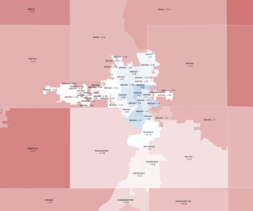
Marathon County, Wisconsin presidential data to the micro level for deeper insights 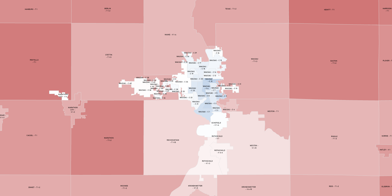
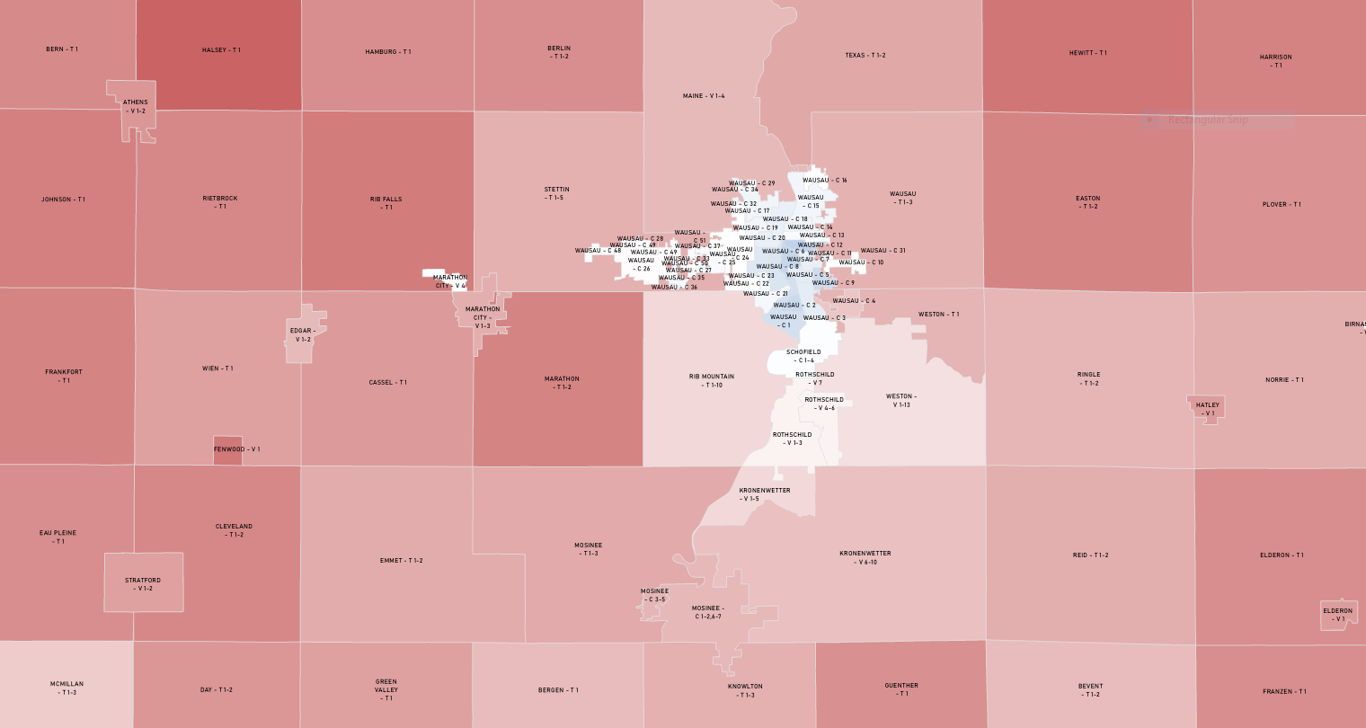
Wausau Urbanized Area Closeup
The perception is out there, that Marathon County in Northcentral Wisconsin at the crossroads of the Northwoods is a conservative county. And that perception isn’t wrong when you look at county-wide election data. But not always at the local level.
Marathon County is a two and a half hour drive north of the bastion of Wisconsin’s progressive movement in Madison. Its economy was supercharged by the lumber and paper-making industries, and other manufacturing has still grown as that industry recedes. Ginseng is an important crop here, but so are Wisconsin’s other staples. Marathon County is long said to have a 60-40 split with Republicans taking in 60% of the county’s votes. That does hold true at the county level. But if you dig a little deeper into the data, another story becomes evident.
Being a government and data wonk, I had already dug into electoral results ward-by-ward out of sheer curiosity. After all, I lived in Wausau, the county seat, for two years and even interned on a state assembly campaign for the 85th assembly district in Wausau. What I found in poking around at the data is that many city wards voted far more progressively than the county as a whole. I had long wondered what this data would look like when it is mapped out. Would there be hotspots or clusters of a certain party identification in the county?
Learning GIS (Geographic Information Systems) allowed me to explore that question more deeply. Using available data from Marathon County GIS and the Wisconsin Elections Commission, I found that the answer to that question is yes. The City of Wausau turned out to be mostly blue, with just two Republican-leaning wards comprising a wealthy golf course development. The City of Schofield, a suburb I had knocked doors in and always assumed would be solidly Republican is actually nearly 50-50. Not a single town or outlying village or city voted similarly to the county seat, though some were more ruby-red than others. And southeastern the southeastern suburb of Rothschild in what locals call the Everest or South Metro was just barely Republican.
GIS is a powerful tool. It can take data from something seemingly abstract and present it in a way that can more clearly communicate nuances in a set of data. Not only can it be used to create striking visuals, but there is a wealth of tools available to further analyze the data from there.